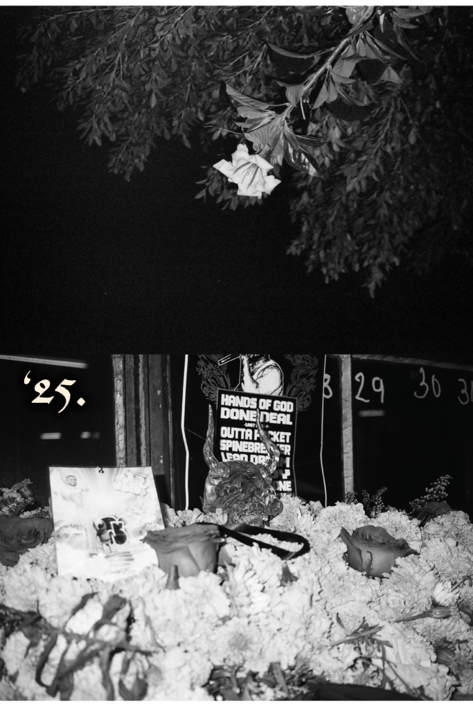
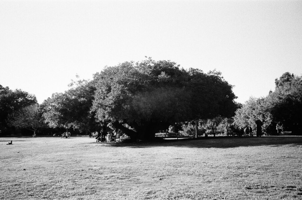


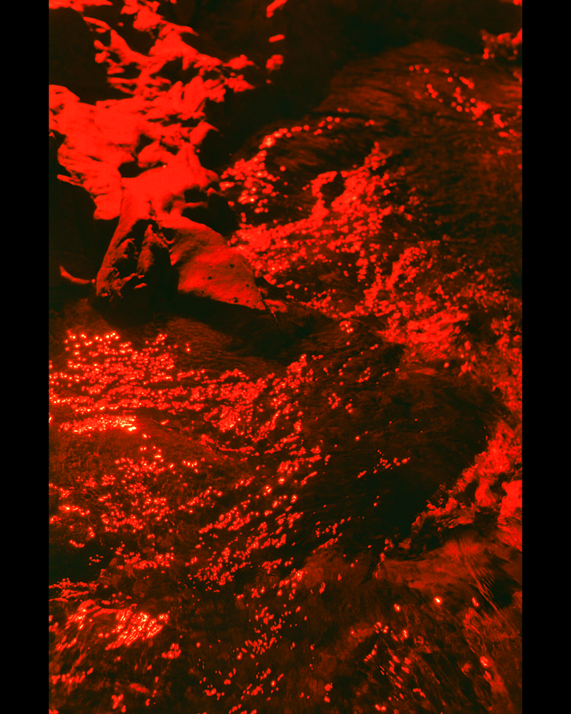

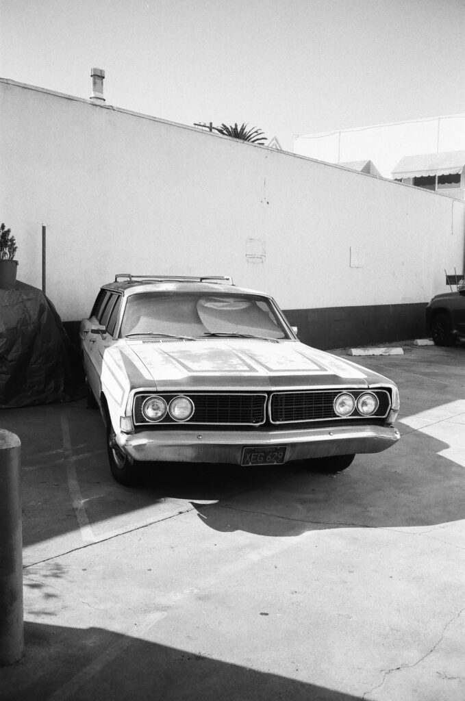
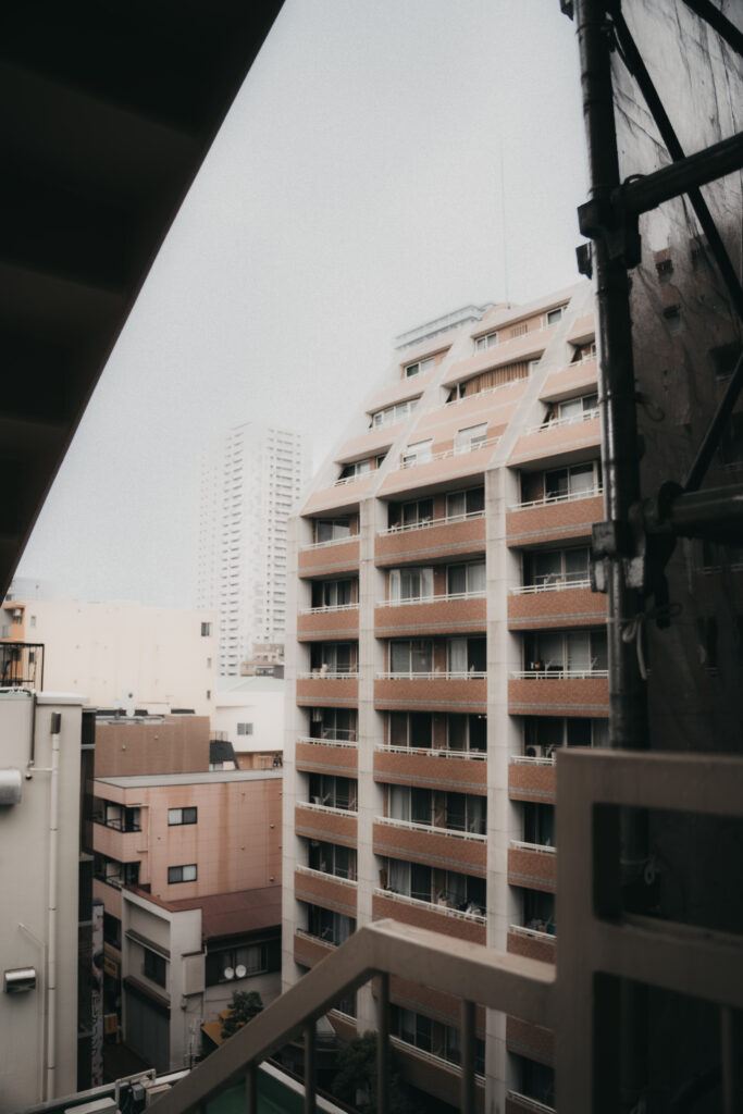
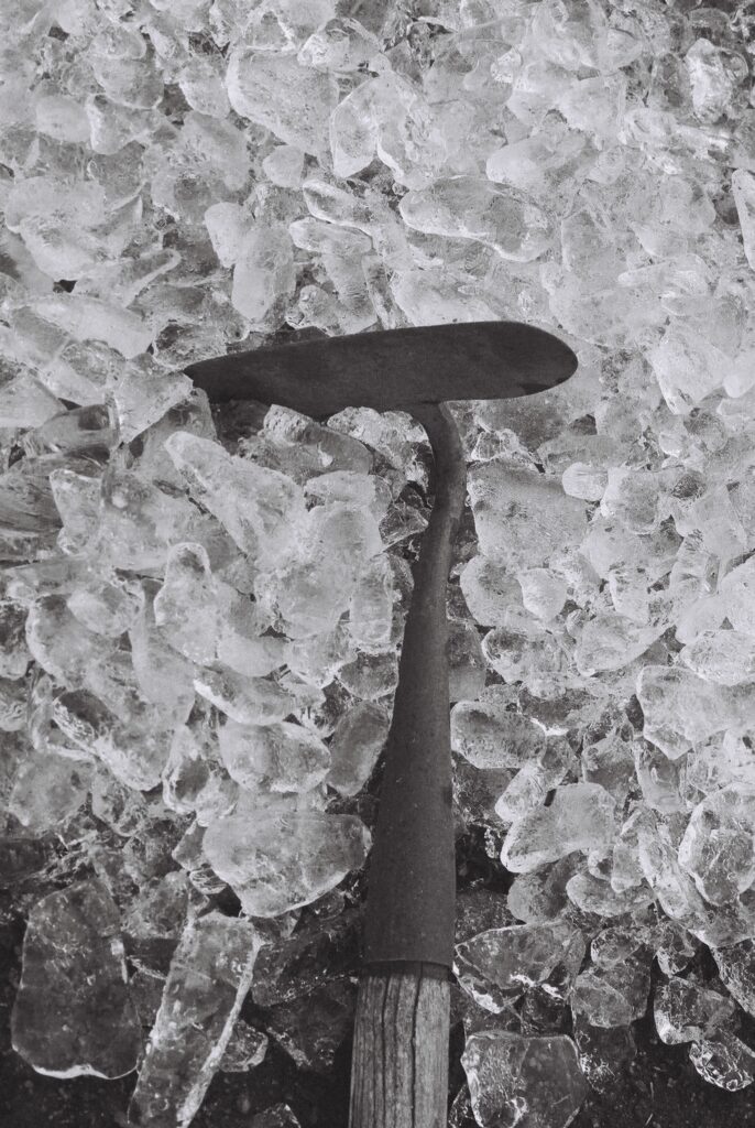
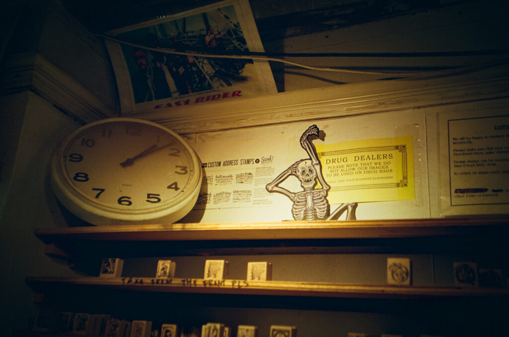
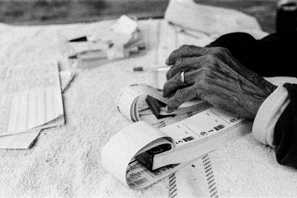


So here’s a test example of what I made…
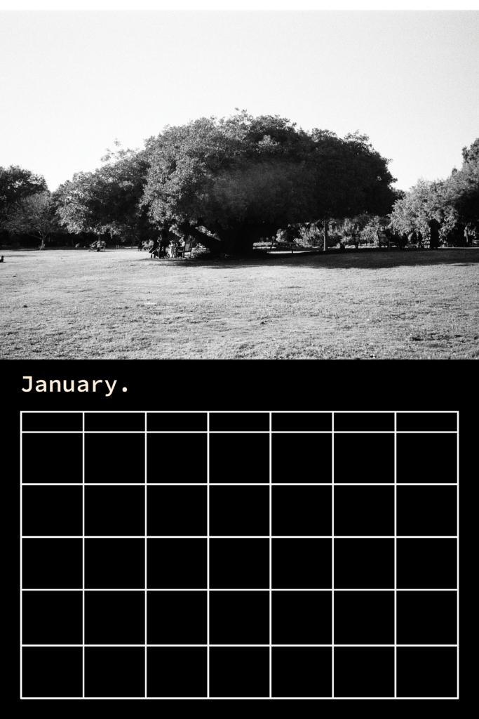
I don’t think it looks bad, but it seems a little basic, for sure. Almost too basic.
I liked the idea of very simple calendar pages, as to not take away from the photos. Because the emphasis is on these photographers and the way these photos feel as they’re assigned to each month.
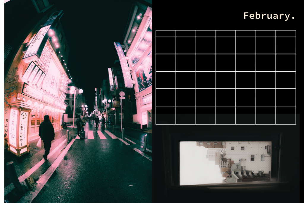
And for the horizontal pieces, I wasn’t sure if we should try to keep the calendar within the same dimensions? Maybe add extra photos by that photographer? Or should we extend the box to fit the whole page? Super open to ideas but I definitely want to keep things simple!